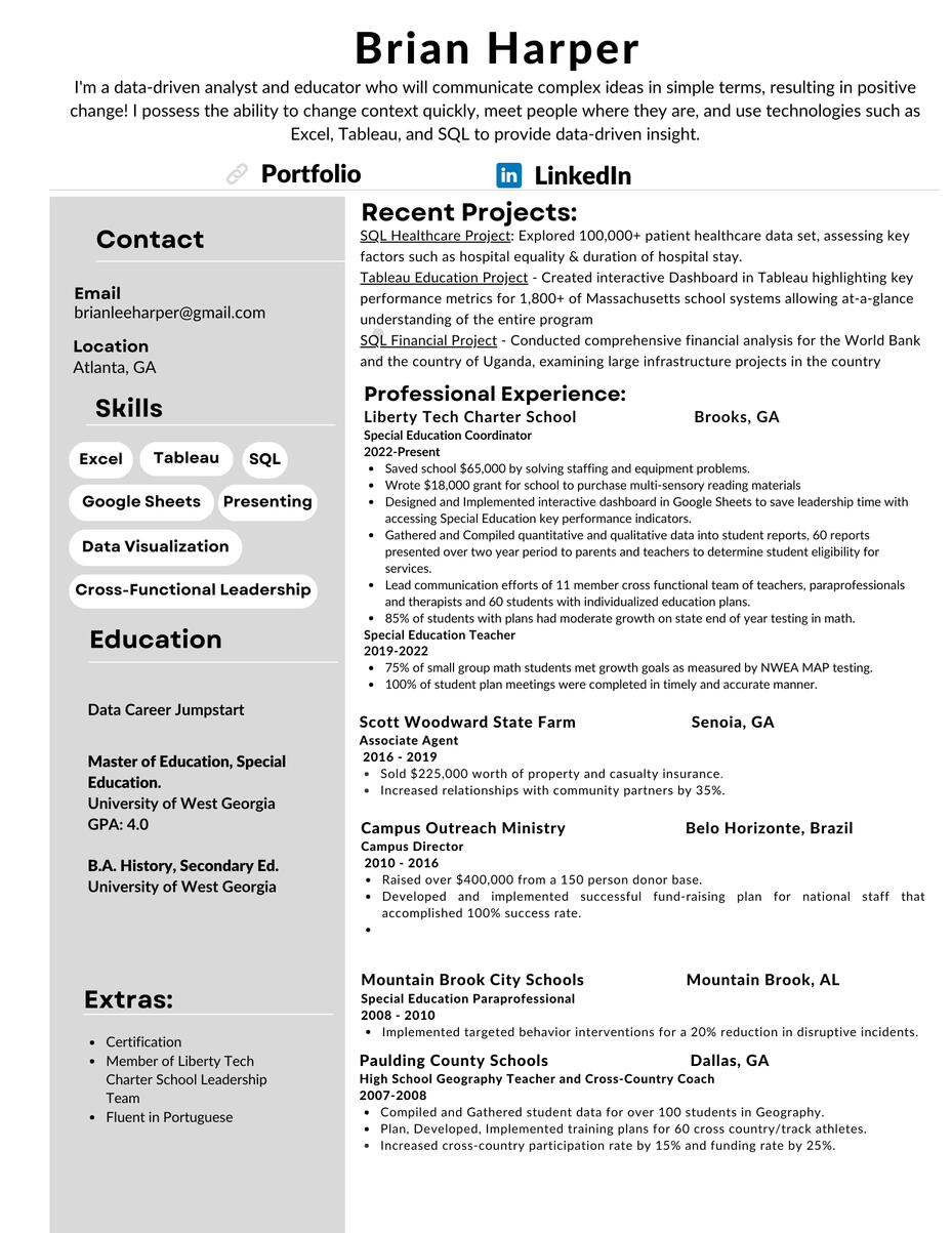
ABOUT ME
Hey, I am Brian, thanks for stopping by.I am passionate about examining and interpreting data to drive positive outcomes. I have experience analyzing data and crafting data visualizations using Excel, Tableau, and SQL. As a lifelong learner, critical thinker, and proactive problem-solver, I am deeply motivated and enthusiastic about continuous learning and fostering the growth of others.I am currently an Educational Analyst and Coordinator at a K-8 charter school south of Atlanta, Georgia. The role is part data analyst, part project manager, part teacher. In my role, I analyze student data to make decisions that encourage student growth and I lead a cross-functional team of 13, that includes teachers, paraprofessionals, and therapists. I possess the ability to change context quickly, meet deadlines and explain difficult concepts in an understandable way.
Skills


SQL
Healthcare Analysis
I analyzed 70,000 rows of healthcare data using MySQL.

SQL
The World Bank In Uganda
I used SQL to analyze the World Bank's role in development in the country of Uganda.
TABLEAU
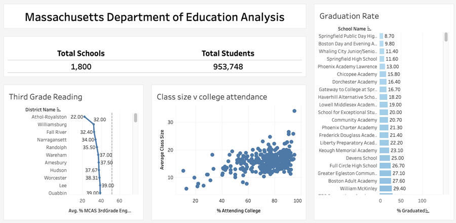
Massachusetts Dept. Of Education Analysis
I analyzed data from the Massachusetts Dept. of Education.

EXCEL
iFOOd Delivery Analysis
I used Excel to analyze data from Brazil's largest delivery food service, iFood.
Who is Making the Grade in Massachusetts?

For this task, I was given the role of analyzing school data from the state of Massachusetts. The dataset was robust and contained information on demographics in the schools, teacher’s salaries, graduation rates and test scores to name a few. With a dataset as large as this set, I narrowed my analysis to three points from the dataset. The three areas of third grade reading scores, class size vs. college attendance, and graduation rates. When examining data from schools its important to remember that each unique school has a unique culture and what works in one school may or may not work in another school. The dataset was downloaded in Excel and transferred to Tableau to complete the analysis
Quick Facts
Total Schools: 1800
Total Students: 953,748
Teacher’s average salary: $74,000
Average expenditure spent on student: $15,000
The Analysis
The analysis started in third grade. Third grade is a critical grade. Students go from learning how to read in the earlier grades, to reading to learn in third grade and beyond. If students are behind in reading by the end of the third grade, learning becomes more difficult in future grades.
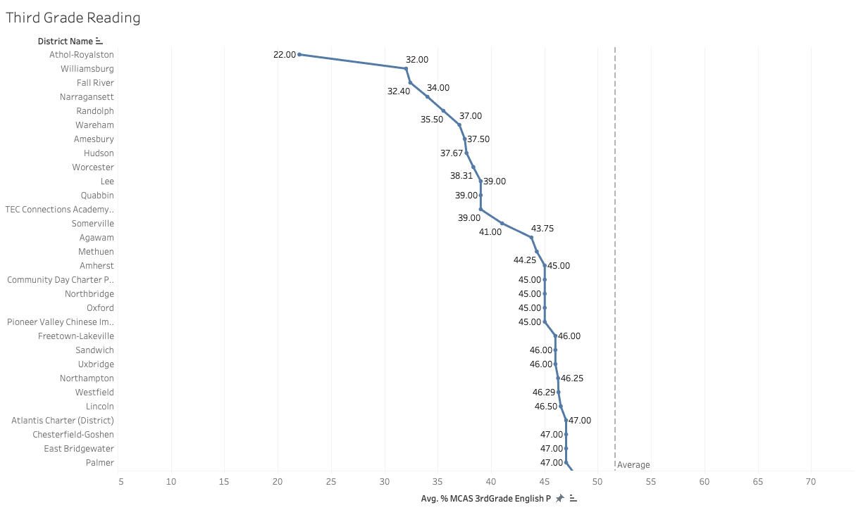
A line chart was created to show which districts are struggling to produce proficient readers by the third grade. The state average is 51%. Almost half of all students are not reading proficiently by the third grade in the state of Massachusetts.Outliers: Athol-Royalston’s third graders are struggling to read. Only 22% of the districts third graders are reading proficiently as measured by the state. The district has one elementary school, only 95 third graders in the district. When the data is small the averages could change widely. The next year data is collected, Athol-Royalston’s third grade reading scores could be widely different.
Class Size vs. College Attendance
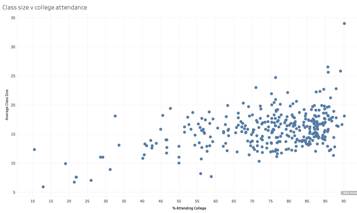
This scatter plot features the amount of students in a class compared to the percentage of students at respective schools who attend college. From looking at the chart, the majority of schools have average class sizes under 20 but the percentage attending college is a large range which leads one to believe that class size cannot be the one determining factor when looking at what schools have a high percentage of graduates going to college.Outliers: If you look at upper right corner of the chart, you’ll notice four schools with average class sizes above 25 and percent attending college over 90. Three of the four schools are charter schools and should be examined further to see if their methods are transferable to other schools in the state with lower college attendance rates.
Graduation Rates
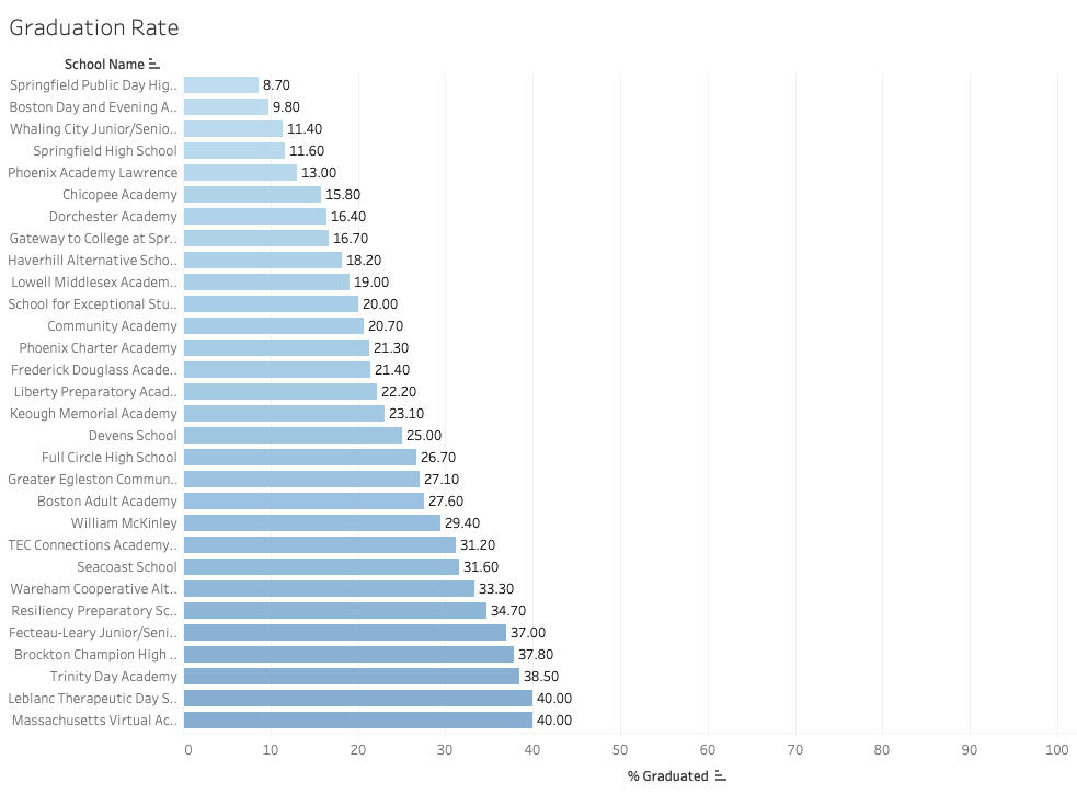
A simple horizontal bar chart was utilized to analyze graduation rates across the state, each name on the y-axis represents a secondary school that tracks graduation rates. Graduation rates can vary widely across schools. Graduation rates are compiled of traditional 9-12 brick and mortar high schools, 9-12 virtual high schools and alternative high schools. Alternative schools vary from schools that have students who are typical high school age to schools that have students returning to school in order to graduate.
Final Thoughts
Schools represent the culture of the community, and not all communities view education in the same light yet every school is judged by how they perform on test scores and other numbers. Examining educational data requires extra care. There are stories embedded in graduation rates and test scores that don’t come through in numbers, and analysts should seek to understand the story behind the numbers before instructing districts and schools to implement guidance from the state.
Thank you reading my Massachusetts Department of Education Analysis, you can follow more of my data findings on linkedin & tableau.
What's the World Bank doing in Uganda

I performed a project with SQL looking at Uganda’s relationship with the World Bank. The data set used can be found here. Uganda is an east African country that gained independence from Great Britain in 1962. Uganda is a landlocked country that touches Lake Victoria on its southern border. The country has a tumultuous past but continues to strive forward with progress. The goal of my research was to discover where the World Bank is spending money to better understand how Uganda is developing as a country. The goal of the World Bank is to provide funding to developing countries to reduce poverty and develop sustainable projects that create flourishing in local communities.
Largest Projects
Here are the top 4 projects discovered by my analysis. You can click on the link below to find out more details on the projects. The number to the right was the starting amount of the project, some of the amounts have increased since beginning the project.
Kampala Urban Development Program: $500 million
Municipal Infrastructure Development: $335 million
Electricity Scale Up: $330 million
Power Sector Development: $300 million
The Analysis
I began my analysis with simple SQL queries to discover Uganda’s maximum and minimum loan, the average service rate charge, and the total amount Uganda owes the World Bank and the total amount Uganda has paid to the World Bank.
Minimum Loan: $-0.08
Max Loan: $316,959,213.49
Average Service Rate: 0.718
Total Uganda owes to the World Bank: $4,085,194,762,249.65
Total Uganda has paid to the World Bank: $484,436,482,708.45
A few examples of the SQL code and output are below
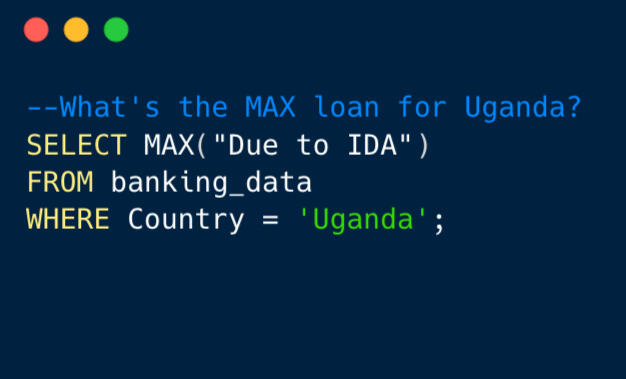
Max Loan
$316,959,213.49
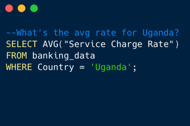
Avg Rate
0.718
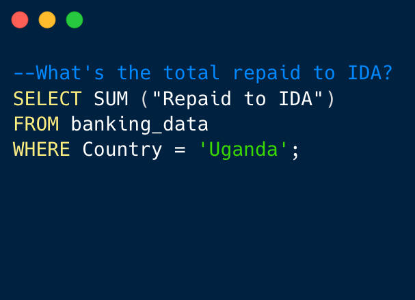
Total Repaid
$484,436,482,708.45
Digging Deeper
After running preliminary queries, I wanted to dig deeper into the data and discover more insights into what the World Bank is investing in Uganda. I wanted to discover trends on where the country is heading and to discover the top projects in the country I ran the query below:
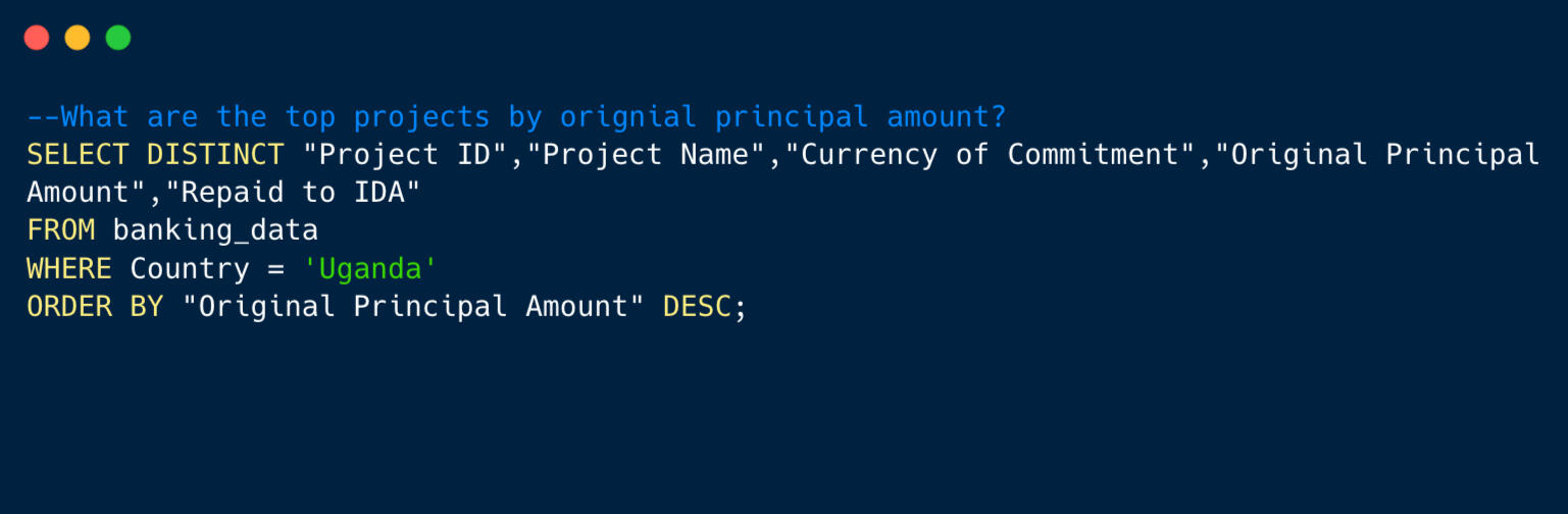
After running the query, I discovered that 4 of the top 5 projects in Uganda are focused on infrastructure. The top 2 projects are focused on infrastructure in cities. The top project focuses on developing the Greater Kampala region, home to almost 4 million people. The second top project seeks to provide infrastructure for small cities in the country.
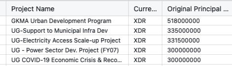
After running this query I noticed the currency was “XDR” for these projects, which lead me to consider something else. What is XDR currency? XDR or SDR is not a currency at all but a collection of 5 currencies, the United States Dollar, the Euro, Chinese Yuan, Japanese Yen and British Pound. Usage of XDR is cheaper for developing countries. More information can be found here.
Next Query:
What are the top projects where United States Dollar was used as the currency of commitment?The last query answered the question about the overall top projects in the country, which was great but it also lead down a rabbit trail of learning what type of currency XDR is. On my next query, I sought to discover the top projects in the country where USD was used as the currency of commitment.
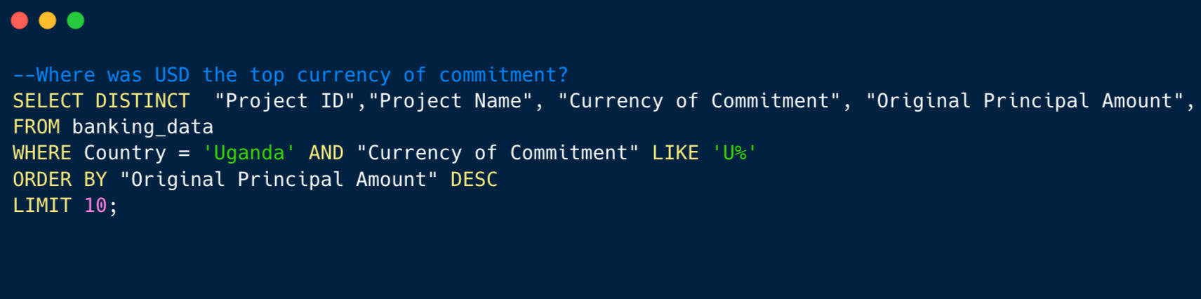
Here are the top projects where USD was used as the currency of commitment. The projects are centered around infrastructure. It is interesting to note that the latest project has a fiscal year notation of 2014. It appears Uganda is using XDR currently as the currency of commitment opposed to USD as XDR is cheaper for countries to utilize compared to USD.
Final Thoughts
The data demonstrates that Uganda is a country using loans from the World Bank to development urban infrastructure. Urban development and energy are the two biggest areas where Uganda is utilizing loans from the World Bank. The data also showed that Uganda used USD more in the past as the currency of commitment but since has moved toward using XDR currency as it is more cost effective. In conclusion, Uganda's strategic utilization of World Bank loans for urban infrastructure and energy development, coupled with a shift towards cost-effective XDR currency, underscores the nation's commitment to sustainable progress and financial prudence.
Thank you for reading my The World Bank in Uganda Analysis, you can follow more of my data findings on linkedin & tableau.
iFOOD Analysis

What is iFood?
IFood is a food delivery app that controls 80% of the delivery market in Brazil, the company does not make food, it simply connects restaurants with consumers. This dataset was assigned through the Data Analytics Accelerator course. I was interested in digging into the data because I spent five years in Brazil, and even ordered from the app while living there.
The Main Point
After analyzing the data, the main point is that Brazilians between the age of 38-51 use the iFood app more than any other age group and this group’s average annual spend is $500.
The company should focus marketing efforts toward this group as it contains the most customers and has room for growth as the group’s average spend is lower than the average spend across all customer sectors.
Quick Facts
· Youngest customer: 24
· Oldest customer: 80
· Average spend for the year: $563
· Total spend for the year: $113,826,719
The Analysis
The data contain 2205 unique customer id’s and contained data on the customer’s age, income, martial status, percent of income spent at iFood, number of visits to the app to name a few.
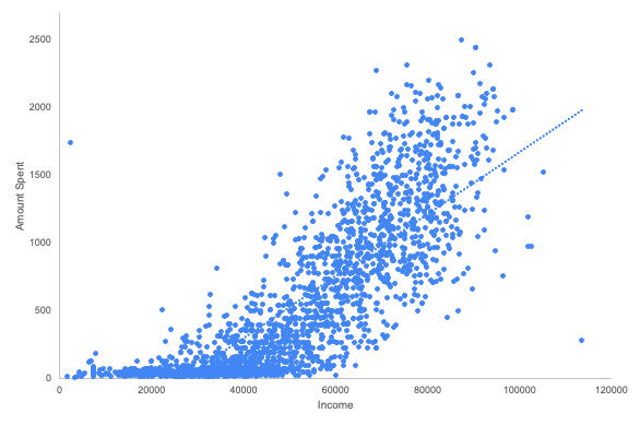
A scatter plot was created to demonstrate as the customer’s income increases they are able to spend more on the app.
What age group uses iFood the most?
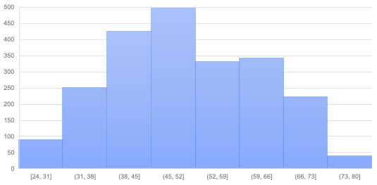
A histogram was utilized to show that 42% of the customers fall between the ages of 38-51 and the next age group of 52-65 make up 30% of all customers who ordered on the app from this dataset.
When did customers join?
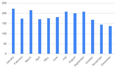
A simple bar chart was utilized to analyze when customers joined iFood. I was surprised by what the data showed here. The month with the highest number of people joining was January and the lowest was December. My initial hypothesis was to see Februrary as the lowest month due to Carnival celebrations, and having lived in Brazil during Carnival, not a lot gets done during that time.
A few of the functions I used to analyze the dataset:
COUNT
SUM
MIN/MAX
COUNTIF
VLOOKUP
Final Thoughts
Analysis of this dataset from Brazilian food delivery giant iFood revealed that as income increases money spent on the app increases, the key age group is between 38-51, and the season does not affect when customers join the app.
Thank you for reading my iFood Analysis, you can follow more of my data findings on linkedin & tableau.
Unveiling Insights with SQL:
Navigating Healthcare Trends and Patterns

For the task, I was given the role of analyzing healthcare data from a dataset based on re admissions for patients with diabetes. The data comes from 130 hospitals across the US and can be found here. The dataset contained two tables, demographics and health. Within those two tables contained data on the patient’s age, race, gender, stay in hospital, and medical specialty to name a few of the columns. With over 70,000 rows of data MySQL was utilized with the dataset. Before we dig into the data, let’s answer the question of why analyze healthcare data?
Why examine healthcare data?Just this past year three Alabama hospitals stopped delivering babies. The three hospitals are in different locations with different clientele and needs but the bottom line is that if you live in a certain area of the state you could be driving as far as 75 miles to deliver a baby. Examining hospital data is important because it affects lives. Hospitals have bills, they have staff that need to be paid and when the bills can’t be paid portions of hospitals or complete hospitals can close. I like to think that by understanding data, hospitals can work with stakeholders to solve problems, like the problems in Alabama where less options exist this year than last year.Link to story on Alabama hospitals: 3 Maternity Units Close in Alabama
A few of the SQL Queries used in this analysis:UNION
COUNT
HAVING
DISTINCT
INNER JOIN
CASE WHEN
Common Table Expression
Fast Facts from the data:Medical Specialties: 73
Average Stay in Hospital: 4 days
Total Number of Patients: 71,518
Most common Medical Specialty was Internal Medicine: 14,635
The Analysis
How many days did people spend in the hospital?The first task I set out to analyze was how many days each person spent in the hospital. I used the SQL query below to bring out the information from the data set.
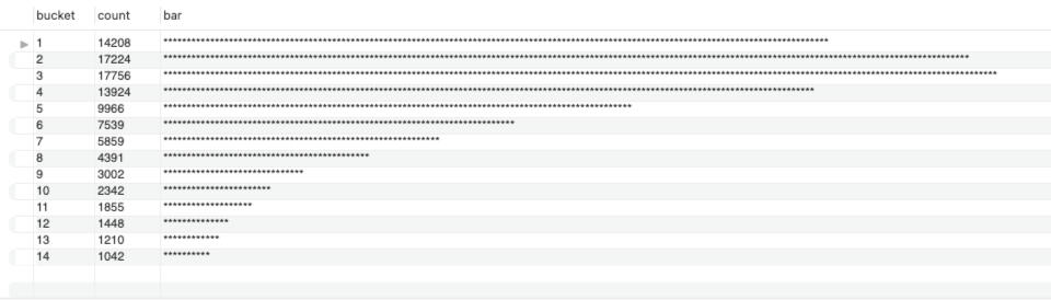
This histogram was created by combining the ‘time in hospital’ column into buckets. Each asterisk on the the results page stands for 100 people. As you can tell from the results, three days in the hospital was the highest number with 17,756 people spending that time in the hospital and fourteen days was the lowest with just over 1,000 people spending that time in the hospital.
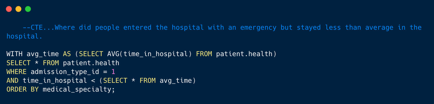
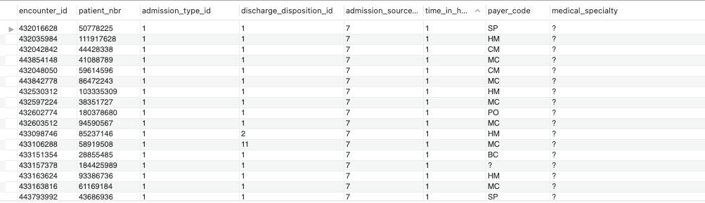
Sticking with time in hospital question, I wanted to investigate how many patients entered the hospital as an emergency and spent less than the average of four days in the hospital. No one wants to spend a lot of time in the hospital and the medical staff want to keep people out of the hospital. This is a win win for the patients and staff. For this query I had to use a common table expression and pulled data from the health table. The total amount of patients who entered under an emergency code and left the hospital in three days or less was 33,684 or 47% of all patients. Almost half of all patients left the hospital in four days or less, that is a great achievement for the hospital staff!
Which race had the highest number of lab procedures on average?To answer the question regarding race and procedures, I combined the health and demographic table using the patient number. This query utilized a JOIN and you can take a look at my SQL query and results below.
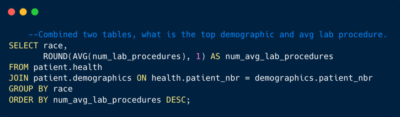
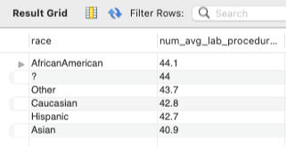
The query is ordered by average lab procedures and you can see that African American’s lead all races with 44 average lab procedures per stay and Asian had the least at 40.9. The best guess on the ‘?’ group is probably people that did not complete intake paperwork or could possibly been an emergency situation where the patient’s needs were greater than complete paperwork.
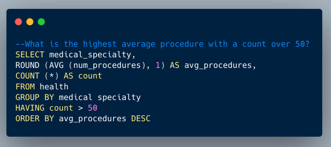
Which medical specialty had the highest number of procedures on average?The next task I was given was to investigate the medical specialty that performs the most procedures on average to discover any trends in the data. In order to find this out, I ran a query that selected the medical specialty from the health table. I calculated the average number of procedures rounded to one decimal place and the count of records for each distinct medical specialty. I filtered the results to include only those medical specialties with a count greater than 50 and are then sorted in descending order based on the average number of procedures.
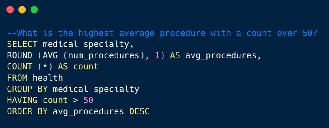
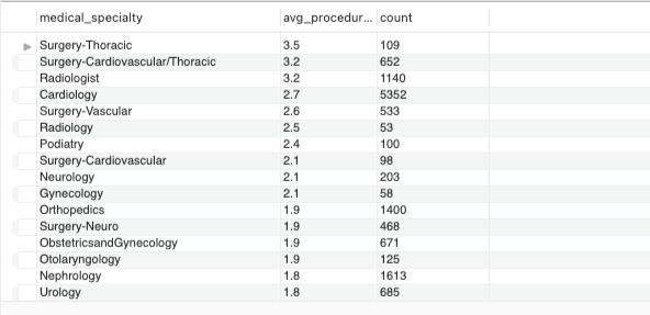
The results show that thoracic and cardiovascular surgeries lead the way.
What about the kids?The next task I was given was to investigate the records on pediatrics and to discover which specific pediatric specialty had the highest number of records. Of the 37 different medical specialties listed in the data base, 9 of them were connected to pediatrics. My goal was to combine all the pediatric records and order them in descending order. To do this I used a Common Table Expression named ‘Cleaned Medical Specialty’ and the second part of the query counts occurrences and groups by original and cleaned values and is ordered in count descending.
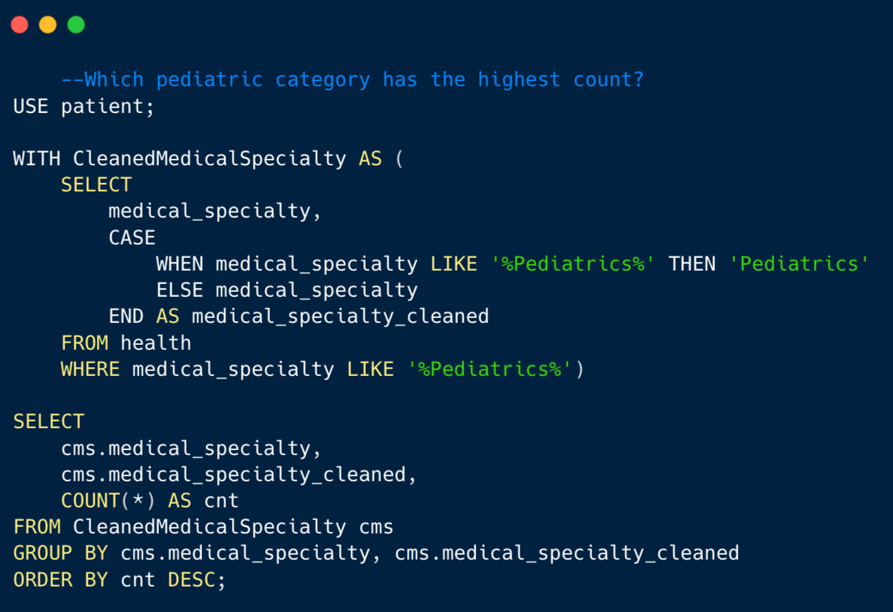
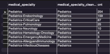
The results from the query show that the general ‘Pediatrics’ medical specialty has the most records at 259 which does not help us that much when considering those 259 records have more detail than the record suggests. The top category of detail is Pediatric-Endocrinology, endocrinology deals with the endocrine system and how hormones are produced in the body, diabetes is a common issue in this area. While the initial query revealed 'Pediatrics' as the most common medical specialty with 259 records, a deeper examination highlighted the significance of Pediatric-Endocrinology within this category, emphasizing the pivotal role of endocrinology in addressing complex issues such as diabetes within the pediatric patient population.
Final ThoughtsThe analysis of healthcare data focused on diabetes-related re-admissions across 130 US hospitals provided valuable insights. Using MySQL, I explored demographics and health tables, uncovering trends such as the significance of minimizing hospital stays. Noteworthy findings include nearly half of all patients leaving within four days and African Americans undergoing the highest average lab procedures. The investigation into medical specialties highlighted Thoracic and Cardiovascular/Thoracic surgeries as leaders. In pediatrics, a deeper look revealed the prominence of Pediatric-Endocrinology, emphasizing its crucial role in addressing complex issues like diabetes in this patient population. This journey underscores the multifaceted nature of healthcare data analysis, offering actionable insights for improved patient outcomes and healthcare practices.
Thank you for reading my SQL Healthcare Analysis, you can follow more of my data findings on linkedin & tableau.